| tags: [ development python Jupyter testing boxplot ] categories: [Development ]
Python BoxPlot Jupyter Notebook
Python Jupyter Notebook
This is an extract from a Jupyter Notebook that I’ve been working on today. I couldn’t quite get the output I wanted from some snowflake query results and I needed a little better understanding of how to present boxplots.
BoxPlot with mutliple categories
I ran into a situation where I needed to summarize some test results where I had two categories.
- The top level (
level1) category contained the name of specific SQL queries - The second level (
level2) identified several different sql servers that were under test.
The query response time responseMS is the milliseconds need to execute the query but excludes the time to stream results back to the client.
import random
import numpy as np
import pandas as pd
import seaborn as sns
import matplotlib
import matplotlib.pyplot as plt
import itertools as it

maxScatter = 200
Determine the number of samples that will be simulated with random data.
sampleCount=int(input("Number of samples:"))
Number of samples:175
Determine the number of unique level1 and level2 categories.
level1Count=int(input("Top Level Unique Values:"))
level2Count=int(input("Second Level Unique Values:"))
Top Level Unique Values:6
Second Level Unique Values:3
Generate the level1 and level2 unique categories
level1 = ["Level1-{}".format(i) for i in range(level1Count)]
level2 = ["Level2-{}".format(i) for i in range(level2Count)]
For a list l randomly pick size items from the list as a generator.
def genRandomChoice(l, size):
    for _ in range(size):
        yield random.choice(l)
def genRandInt(s,e,size):
    for _ in range(size):
        yield random.randint(s,e)
Build a data frame with two level categories and random samples
querytime = pd.DataFrame({'level1':list(genRandomChoice(level1,sampleCount)),
                    'level2':list(genRandomChoice(level2,sampleCount)),
                    'responseMS':list(genRandInt(5,5000,sampleCount))})
Check a sample of the querytime fake data to make sure that it represents the data that I have.
querytime.sample(3)
.dataframe tbody tr th {
    vertical-align: top;
}

.dataframe thead th {
    text-align: right;
}
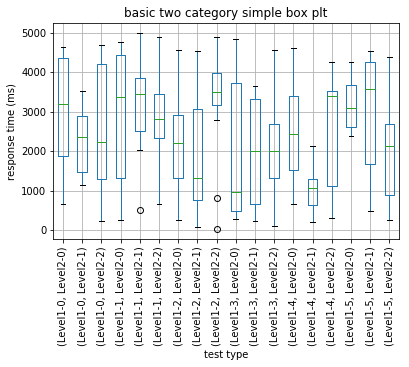
Quick first attempt at a box plot. Can see what I need, but hard to communicate to others.
querytime.boxplot(by=['level1','level2'],rot=90,boxprops=dict(color='green'))
plt.title("basic two category simple box plt")
plt.suptitle("")
plt.xlabel("test type")
plt.ylabel("response time (ms)")
plt.show()
Decided to try out Seaborn as it’s referenced quite a bit now…
Code derived from:http://cmdlinetips.com/2018/03/how-to-make-boxplots-in-python-with-pandas-and-seaborn/
Going to have to dig a little deeper to find a two category representation.
sns.boxplot(y='responseMS', x='level1',
                 data=querytime,
                 width=0.5,
                 palette="colorblind")
plt.title("Seaborn box plt one category")
plt.suptitle("")
plt.xlabel("test type")
plt.ylabel("response time (ms)")
plt.show()

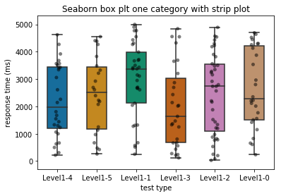
It’s always nice to see the points representing the box plot – unless there are too many points. After a point, the points overload and should not be presented.
sboxplot = sns.boxplot(y='responseMS', x='level1',
                 data=querytime,
                 width=0.5,
                 palette="colorblind")

#if there are too many points, then don't bother with the scatter.  It'll be saturated.
if(len(querytime) <= maxScatter):
    # add stripplot to boxplot with Seaborn
    sboxplot=sns.stripplot(y='responseMS', x='level1',
                       data=querytime,
                       jitter=True,
                       marker='o',
                       alpha=0.5,
                       color='black')

plt.title("Seaborn box plt one category with strip plot")
plt.suptitle("")
plt.xlabel("test type")
plt.ylabel("response time (ms)")
plt.show()
Swarm scatter plot adds a little organization to the scatter that is interesting.
# plot boxplot with seaborn
bplot=sns.boxplot(y='responseMS', x='level1',
                 data=querytime,
                 width=0.5,
                 palette="colorblind")
if(len(querytime) <= maxScatter):
    # add swarmplot
    bplot=sns.swarmplot(y='responseMS', x='level1',
                  data=querytime,
                  color='black',
                  alpha=0.75)

plt.title("Seaborn box plt one category with swarm plot")
plt.suptitle("")
plt.xlabel("test type")
plt.ylabel("response time (ms)")
plt.show()

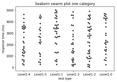
Just wanted to see the swarm without the box plot.
# add swarmplot
if(len(querytime) <= maxScatter):
    bplot=sns.swarmplot(y='responseMS', x='level1',
                  data=querytime,
                  color='black',
                  alpha=0.75)

plt.title("Seaborn swarm plot one category")
plt.suptitle("")
plt.xlabel("test type")
plt.ylabel("response time (ms)")
plt.show()
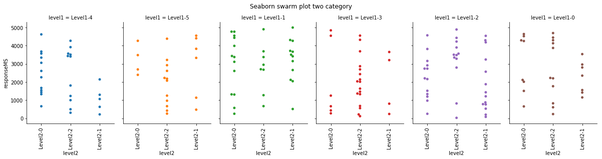
Digging deeper into the two category presentation. Had to read up on catplot. Seems like what I need.
if(len(querytime) <= maxScatter):
    g = sns.catplot(x="level2", y="responseMS",
                    hue="level1", col="level1",
                    data=querytime, kind="swarm",
                    height=4, aspect=.7)
    g.set_xticklabels(rotation=90)
g.set_xticklabels(rotation=90)
g.fig.suptitle('Seaborn swarm plot two category')
plt.subplots_adjust(top=0.85)
This is what I was looking for. For each level1 category, compare the level2 category box plots.
g = sns.catplot(x="level2", y="responseMS",
                hue="level2", col="level1",
                data=querytime, kind="box",
                height=4, aspect=.7)
g.set_xticklabels(rotation=90)
g.fig.suptitle('Seaborn box plot two category')
plt.subplots_adjust(top=0.85)

Jupyter Notebook to Hugo static
Also I wanted to see how much work it is to convert a Jupyter Notebook to a hugo markdown. Not too hard.
-
From Jupyter, select file -> Download as -> Markdown. Will download a .zip containing the notebook as a .md as well as all plots in png format.
-
Move markdown file into hugo static folder and inject
+++header block containing title, date, description, etc. -
Move the .png images into the hugo
static/imgdirectory. I added a prefix to them to pin them to the article. -
revise the png comments in the markdown from:

to

